I’m always looking out for new WordPress themes. I don’t want to change the theme of my site but I do like to download free ones that I like, test them in my staging area, and file them away for possible future use somewhere. Here are 5 new(ish) themes that I across recently that I liked and decided to share with you.
I’ve listed the main features, included a couple of screenshots, and linked to the demo. Let me know in the comments which one is your favorite, whether you even like them, or why you don’t like them at all. One note – I haven’t tested any of these themes yet. My opinion is based on the way that they look, not on the way that they work.
Digital Statement
Features
- Post Slideshow
- Content Tabs
- Widgetized
- Twitter Ready
- Flickr Ready
Natureal
Features
- 3 Columns Fixed Width
- Widget Ready
- Gravatar Enabled
- Valid XHTML
Color Paper
Features
- Featured Block at Top of Layout
- Style Switcher
- Fixed Width Layout
- Clean Layout and Typography
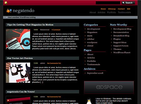
Negatendo
Features
- Valid XHTML 1.0 Strict
- Valid CSS Level 2.1
- Gravatar support
- Widget Ready Sidebar
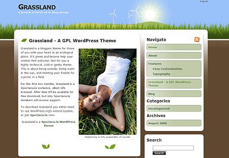
Grassland
Features
- Widget Ready Sidebar
- Additional navigation widget for a smooth look
- Fireworks source image for easy updating
- WordPress MU compatible
photo credit: ezu

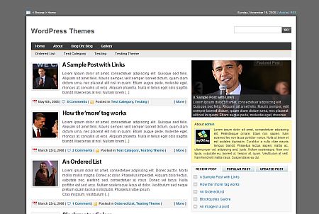
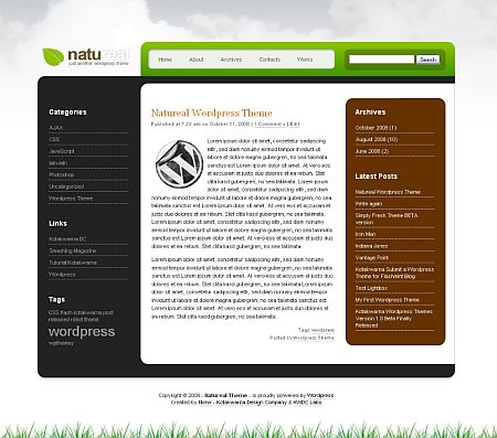
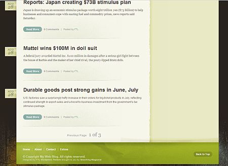


Ooh, I like Natureal. I’m a sucker for rounded corners. Now if only I had a site to use it on…
Dave’s last blog post – WordPress 2.7 is about to become the only CMS you’ll ever need
@Dave – Have you worked with rounded corners done in CSS? Looks nice but it’s a lot of code for that effect. I learned how to do it recently but then the client ended up not wanting them. (I like them too).
Yip, I do it all the time. Generally they’re a complete waste of effort, but they look nice, which has to count for something
Dave’s last blog post – WordPress 2.7 is about to become the only CMS you’ll ever need
Looooove Digital Statement. So clean, crisp and professional looking. Definitely am going to add it to my theme collection for future use.
Thanks Kim!
Stuart Foster’s last blog post – Barack Obama: America’s First “Internet” President
Sweet, I’ve been looking for a theme that suits lots of very short posts for a lifestreaming site. Looks like Digital Statement could be just what I need unless you have any better recommendations?
andymurd’s last blog post – An Introduction To HTTP
great themes, please feel free to submit your free themes to our site here http://www.wpthemes4free.com/add-theme/
Free WordPress Themes’s last blog post – WordPress Theme : eliba 10
@Dave – They do look nice ;-)
@Stuart – Thanks for visiting and commenting! I’m glad you liked Digital Statement. If you use it, let me know. I’d love to see it.
@Andy – I’d have to look into that a little. This might be overkill but are you familiar with the Agregado theme?
http://www.smashingmagazine.com/2008/09/08/agregado-a-free-wordpress-theme/
I’m not sure about the purplish color but it has a lifestreaming module built right into it.
I’ll look into others when I get a moment.
Aggregado is pretty sweet, but I don’t want the separation of my lifestream from the blog posts. I’ll be working on integrating SweetCron so it posts directly to WP so I can use all the plugins.
I agree with you about the colour, I much prefer light backgrounds for web pages.
I like Grassland… I like a clean look.
Vered – MomGrind’s last blog post – And The Winner Is…
Awesome Kim – I changed my theme so many times in the early days. I really like the digital statement theme. But did you know, you can get one of the Revolution themes, like the one I have for free now?
I think I only paid something like $75 dollars for my theme and I can’t remember the customization price in dollars – maybe around $250. It’s worth it to get what you want – and a whole lot cheaper than having a theme designed from scratch. But I used lots of free themes for the first nine months of my blog. There’s so many talented designers out there.
@Andy – The older I get the harder it is to read pages with dark backgrounds.
@Vered – I’ve been thinking a lot about simplicity. I really need to figure out how I want to manage my sidebars.
@Cath – Thanks! I do know that Revolution is free now – Digital Statement reminds me of it. Personally, I think that free or customized themes are the way to go. I am not a big fan of the Premium theme model, although I have to admit that Thesis has really good support.
Ah, thanks for these, Kim! I’m doing a quick web build for my mom’s photography business and a couple of these might fit in great. If you’ve got any suggestions for ‘photo-friendly’ WordPress themes, by all means, lemme know! The ones I’ve found on cursory google searches haven’t impressed.
I look at themes in terms of whether I would use them personally or not, since I don’t have clients to please.
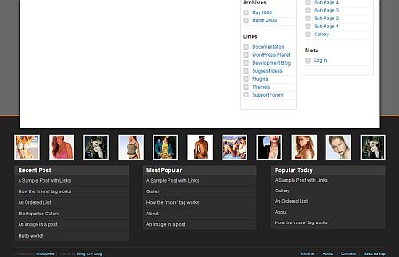
With that in mind, I suppose I like Digital Statement the best because it is so clean. I’m of two minds about the expanded footer: I wonder how many people actually scroll down that far!
I suppose I’ve been spoiled by Thesis, which does everything I want and more. I looked at literally hundreds of themes and never found what I wanted until I happened on Thesis. Sure I paid some bucks for it, but I’ve gotten my money’s worth several times over.
Mike Nichols’s last blog post – Dizzy? It May Be an Anxiety Disorder!
@Mark – Well, I answered you on Twitter so this response really is for everyone else.
I haven’t reviewed this list of resources yet, but I bookmarked this page of photoblog resources just today. Maybe someone will find it useful.
http://wpcandy.com/articles/photoblogging-with-wordpress-round-up.html
@Mike – Thesis users seem to love it. It is SO clean too. I’m still confused by hooks though and haven’t taken the time to learn them properly.
I kind of collect themes – I’ve been doing it for awhile. I’m kind of fussy about them. For example, I like the look of Negatendo but would never use it for myself. Mostly because I wouldn’t be able to read it.
@Mike – Oh .. I forgot to comment on the expanded footer … It depends, do you ever see mine? I think I’m the only one who uses it ;-)
These are different… I am in need of some new themes. Thanks for posting them! :)
~ Kristi
Kikolani | Poetry, Photography, Blogging Tips’s last blog post – Rays of Sunlight
If I were to start another blog (without a custom theme), I would use the Natureal one for sure.
Carla’s last blog post – Holiday Gift Ideas | Reduce the stress and clutter
@Kristi – Great! I hope you find something you like.
@Carla – I like that one too. I’ve been looking at it on and off throughout the day trying to think up something that I could use it for. I have two sites that I’m hoping to redesign by the end of the year but it’s not quite right for either one of them.
You found some great finds!!
Susan’s last blog post – Mad Magazine
Wow, good looking WP themes.I would choose The “Digital Statement” theme for business use, it looks professional and trustworthy.
@Susan – Thanks!
@Tom – Thanks for visiting and commenting. Digital Statement seems to be the overall favorite.
Nice find Kim. My fav ones in this seems to be Digital Statement followed by Negatendo
Madhur Kapoor’s last blog post – Remove Partial Software Installations with Windows Installer Cleanup Utility
Although they’re all different…they all look the same. I guess that’s just the nature of a blog as opposed to a Flash-bang wallop website with bells and whistles.
David Bradley’s last blog post – Virtual Rehabilitation
@Madhur – So far you are the only one who says he likes Negatendo. Digital Statement is definitely the fave.
@David – Yes! More flash! We don’t have enough flash.
@Kim No no no. less Flash. Please, no more Flash on the Web. That should spark a discussion…
@Dave – I was being sarcastic. I guess that wasn’t clear without the winky. I wish the sarcasm tag would become a standard.
Thanks Kim. I knew all but negatendo, looks impressive!!
Raju´s last blog post – [Timepass Tip] Run Websites From Windows Calculator
@Raju – Thanks! I’m considering Digital Statement for a project I’m working on. I’m not quite sure yet.
I’m playing with the Digital Statement right now. It’s live. Sort of. It does require a little extra work tweaking a bunch of different things, and the creator didn’t make the downloads available separately (plugins separate from theme), so those of us with One Click Installer have to do 6-10 steps to install it versus two.
Still, it looks great and has lots of cross-indexing built in.
Very cool!
@Gib – Thanks for letting me know! I almost tested that theme earlier today but got distracted by something else. It does look great but it also looks like it takes some extra work to get everything set-up properly. I’m going to keep checking out how it looks :-)
Kim – after leaving a comment elsewhere I was looking around your site and so surprised to find myself looking at a mention of our Grassland theme. Thank you so much for listing it! Much appreciated :-)
GPL takes a lot of work and time and it’s great to see people listing it. Thank you again.
David Coveney´s last blog post – WordPress.org Pull 200 GPL Themes
@David – What a delightful coincidence! It’s lovely and simple looking. But I know what a pain the rounded corners can be. It’s ridiculous that WordPress won’t list it.
I really like Digital Statement, though I really like the theme you are using best! is your theme built from scratch or based off another building-block-theme? I might use Digital Statement as a building block and customize the crap out of it. it’s the first one to really grab and shake me lately :) good finds!
Terri Ann´s last blog post – Clipboard Express – WordPress Plugin – New Release!
@Terri Ann – Thanks for visiting and commenting. I have a custom theme.
Digital Statement might be a good starting point for customization. I’ve seem people do a lot with Arthemia too.
http://michaelhutagalung.com/2008/08/arthemia-20-released-the-updates/
Thanks for providing links to the themes. I liked the Digital Statement theme the most.
I also liked the Negatendo theme except for its color combinations. Can this theme be customized for colors?
.-= Ravi Kuwadia´s last blog ..Backlinking Strategies that Work =-.
Hi Ravi – I’m glad you like the themes. I haven’t used Negatendo but I’m sure the colors can be modified via the style sheet.