I’ve been collecting all sorts of WordPress themes lately. I started this week with 5 New(ish) WordPress themes and am ending it with 5 Ugly WordPress Themes.
As a note of kindness, I’m sure that the theme authors were learning how to make themes and decided to try something different. For example, while the Retro Mac one is ugly, it probably wasn’t that easy to make.
And if I ever get around to making a theme, I’m sure someone will think it is ugly too. Actually, I have designed sites that I thought were ugly, but made what the client wanted. There’s no accounting for taste.
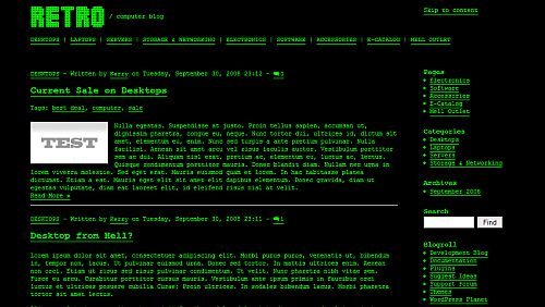
Retro
Ok, I get the idea with this. It’s like old school command line with a Matrix twist. But it is completely unreadable. I can’t imagine why anyone would want to use it – I wouldn’t even be able to use the command line with these colors.
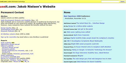
UseIt
This one doesn’t have a demo but it is based on Jakob Neilsen’s website about usability and accessibility online. For years we’ve known that Jakob has great information but his site is not pleasing to the eye. Actually the layout isn’t so bad but the colors don’t work at all.
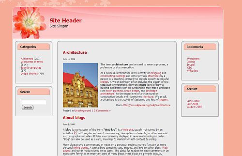
Glamour
Ok, maybe someone will find this more appealing than I do but it’s not working for me. The combination of the pink, peach, font and red links don’t say Glamour. I’m not much into the girly stuff but can appreciate a a feminine design. This isn’t it.
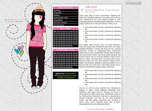
Ugly Princess
Ok, this one was kind of handed right to me since it is called Ugly. The graphic isn’t so bad but the post and navigation areas are too small. There is a lot of empty space to the right that could easily be used for the content. And the black and pink navigation area is not user-friendly at all. If I was an angry preteen, though, this might be the theme for me. Hmm … I was an angry preteen (and teen and young adult …) and I don’t think I would have wanted to be called Princess.
Retro MAC
The first computer I ever used was a blocky MAC Classic and this theme reminds me of it. It’s clever … and it’s ugly.
Know of any other’s that you would like to add? Or do you disagree and like any of these?
photo credit: Bethany L. King


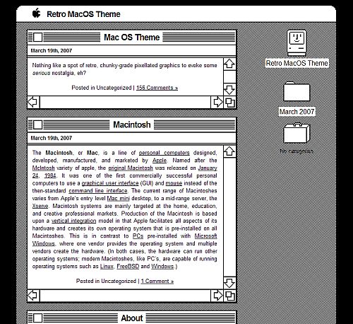

Wow, I’ve seen some ugly WordPress themes in my day but that retro Mac one takes the cake!
Jeffro2pt0´s last blog post – Which Motrin Ad Is Offensive
i’m on my 3rd wordpress theme. i imagine there will be a fourth, but not one of the above. i might be looking for something with soft colors and not the blue that i have…natural colors :)
Natural´s last blog post – Being Human In the Age of the Electronic Mob
The Retro one puts a lot of strain on the eyes.
Madhur Kapoor´s last blog post – Remove Partial Software Installations with Windows Installer Cleanup Utility
Damn, mine didn’t make the list.
Gross! I mean some of them…
@Kim, by the way, November seems to be the month of frustration for you :lol: at least from post titles… I see a lot of ‘annoying’ , ‘ugly’, ‘strange’, ‘psychic’ powered titles….
just kiddin’
cheers,
Ajith
There’s actually a new Gmail theme that looks just like the first green and black Retro. I tried it and I would be surprised if anyone could look at a site in that style for more than five minutes without going blind or never being able to interpret the color green again.
Ron Obvious´s last blog post – http://strangemaps.wordpress.com/2008/11/15/330-from-pickin-cotto…
@Jeffro – And I remember using a computer that looked like that :-)
@Natural – Glad you won’t be using one of those ;-)
@Madhur – I don’t think it would really be possible to use the Retro one. I can’t think of a single use for it.
@Dave – You already got your props from CSSMania ;-)
@Ajith – Actually, I think you’re on to something. I don’t like November and have been having some personal problems so that must be coming through in the articles that I’ve been writing.
@Ron/Jim – I saw that Gmail theme last night too. I was thinking that now the Retro was everywhere.
Wow – that Retro Mac really makes my eyes hurt – but in a strange way I can appreciate the design….
And the bit about having to design ugly sites for clients? Oh god – I’ve
had to do some that afterwards I said it ok if they didn’t mention I did the work at all. (And when I think of the pretty ones they turned down!)
But for some folks there is no accounting for taste!
Thanks, I enjoyed this post!
Tawnya´s last blog post – I’m Begging You – Please Don’t Let My Show Get Cancelled
These are ugly indeed. When I first installed WordPress and was looking for a theme, there were plenty more ugly ones as I recall. :)
I totally agree with you about Retro. Anything with a black background is very hard to read/look at no matter how contrasting the font is. It may not be so bad if I wasn’t on the computer 10-13 hours a day. Plus, if I’m reading at work, I don’t want my screen to stand out that much.
Though Retro MAC is kind of cool, it’s not easy on the eyes either.
Carla´s last blog post – Holiday Gift Ideas | Not Buying it
@Tawnya – Oh I completely know what you mean about not wanting your name anywhere on a design ;-) Retro Mac is unusable but it’s also cool – I don’t think it was an easy design.
@Vered – Jeff said the same thing. There are a lot of terrible designs out there.
@Carla – I have a hard time with light text on dark backgrounds – it looks cool but is unreadable.
Retro green text and black background brings back the Commodore64 memories! -lol- So funny
Loretta´s last blog post – Helping a Good Cause to Stop Violence, UNIFEM
AAAAAA!!! My eyes! OMG, I’m blind!!!!!!
Thanks (I think) for sharing this!
Oh and by the way, GREAT tweet to get me here. How could anyone resist that?
Cheers
George
Tumblemoose´s last blog post – Should a writer self-publish?
@Loretta – Thanks for visiting and commenting! Was it the Commodore 64? My computer use doesn’t go that far back.
@George – Oh yeah! It’s the classic whatever you do don’t look behind you trick ;-) Of course, you can’t resist looking.
As I was scrolling down this list I was hoping you added Retro MAC and you did, Awesome! It’s by far the worst eyesore.
Yes, I just blogged about the Gmail theme.
I really tried to use it for a day, but made it through an hour — an hour I didn’t check email.
Once I checked again, I thought — ouch!
The retro Mac theme and the retro theme proves we can’t transcend ugliness sometimes — we have to age past it.
Those are pretty bad. The Retro Mac one especially, but I’d guess there are some types who would find it fun.
I can’t help but feeling sorry for the ugly kitty picture though.
~ Kristi
Kikolani | Poetry, Photography, Blogging Tips´s last blog post – The Weekend Puppy Post
@Matt – I really should take a look at the css for that theme though. I’m curious about it.
@Gib – Thanks for visiting and commenting. I took a look at all of the different gmail themes but there’s no way I could have used the Retro one – even for an hour.
@Kristi – I doubt the kitten was ugly. They probably just wrote the sign that way to get people to take notice and stop. Even an ugly cat usually starts out cute. Seems that Retro and Retro Mac and generating the most conversation.
I don’t actually think those are that bad. The Ugly Princess one reminds me a bit of the stylistic CuteNews fan sites.
There’s no such thing as an ugly cat.
Wesley´s last blog post – It’s been 6 days and Julia Allison still hasn’t responded to my email.
arckh some really bad themes :p
But yes some of he gmail themes are a pain too…ive settled on the ‘desk’ one as it looks cool…but I suppose when the novelty wears off i’ll switch to the old style…worked well enough. As they say ‘if it ain’t broke don’t fix it’.
@Wesley – What are CuteNews fan sites? I think there are ugly cats but there probably isn’t such a thing as an ugly kitten.
@Donace – I’m a little disoriented by my gmail theme too. I don’t care for the default theme though.
Yes, that’s what meant.
Wesley´s last blog post – It’s been 6 days and Julia Allison still hasn’t responded to my email.
I reckon that the pick of the bunch was Glamor as the only thing I didn’t like about it was the color combination and the header. The header could probably be fixed quite easily but I could not live with the color. Maybe it’s a bloke thing?
Sire´s last blog post – Wassup’s Bloggers Forum Adding To The Blogging Experience
@Sire – No. I guarantee it’s ugly to both genders.
That mac theme is horrible. I could tolerate reading the others even though they are ugly. The mac theme is the hardest to read.
Nicholi´s last blog post – Cool Looking Graphs
Hi Nicholi – Thanks for visiting and commenting. Can you read the green on black one? I’d have a much harder time with that one than any of the others.
You did well, Kim – finding ugly! These are some real winners (at bad design)! Retro is probably the one I like the least – but then, I really don’t like any of them…
Lance´s last blog post – Don’t Worry, Be Happy
@Lance – Well, thanks :-) Ajith thinks I’ve been negative lately and I think that I would have to agree with him.
OK – retro Mac is officially the ugliest theme I’ve seen in awhile. Ugly Princess needs a little more angst to be truly effective. =)
Ugly princess is cool!!
Elaine B.´s last blog post – 8 Things You Need to Be Once You Have Your Site
Where do you get hold of these? LOL!!
For someone like me the brain involunatarily ignores templates like these, but your’s catches them and makes note of them ;)
Raju´s last blog post – PC Magazine – One Year Subscription for Free
@Beth – LOL – more angst :-)
@Elaine B. – Thanks for visiting and commenting. Do you like Ugly Princess? I think the main problem with it is it isn’t using space efficiently.
@Raju – Hmm … what are you saying about my mind? ;-) LOL
Hi Kim – these are beyond ugly – especially the green text one. I suck at design but even I would struggle to createsomething as hideous as these.
Cath Lawson´s last blog post – Does Your Business Really Understand People?
@Cath – I’m sure most of them were hard to design. BTW, Thanks for the twitter love.
Haha…I liked this list! RetroMac is definitely NOT pretty.
Susanq´s last blog post – The Bel Air Real Estate Theme
@Susanq – Thanks! RetroMac is nostalgic but it isn’t pretty.
hey, i like your post. i agree with you that the 1st, 2nd and 5th themes are just not most people’s type. i especially hate the RetroMac however, for the 2 girly themes, i think some would still use it and they’re not totally ugly.
Twilight Fan´s last blog post – Dinner at Red Kimono 30112008
@Twilight Fan – Thanks for visiting and commenting. The girly ones aren’t AS bad but I still think they are ugly.
Oh. You are right, these are ugly. Do people really use them? With so many great ones out there for free people use these. Tell me no.
Sommer-Green and Clean Mom´s last blog post – Itsabelly’s Guide to Going Green with Baby
@Sommer – I have not seen these on any sites but someone told me they’ve seen ‘Glamour’ on Christian sites for women with organ music playing. Kind of sounds like something that would scare me away from religion. ;-)
Thanks for listing my RETRO design as one of the 5 ugliest. I am so glad I can use terminal emulation to logon to a mainframe these days in stead of a dumb terminal (not that I do it very often but sometimes). This theme really morphed from a way to use graphics to display a blog title. If you use A-Z 0-9 in your blog title the pretty (hehehe) blog title shows up with graphic letters. All things being equal, if you like the layout, pull out a css book and change the background and text colors to something preferred.
ps. Hey, I’m not defending the design just some of the design elements. Heaven knows I should sue someone for the sight loss I endured while looking at this color scheme.
k.
Kerry Webster´s last blog post – I love my job…
@Kerry – Thank you for visiting and commenting. I hadn’t thought of what the theme would look like with different colors – it does have a good layout.
I guess if you’re going to sue someone for sight loss, it’s going to have to be yourself ;-)
jejeje, if the retro are really ugly .. this joke as well, but to use them are very ugly
glamor is not my style .. but I have seen many people using any such
Hi Maru – Thank you for visiting and commenting. Other people have
told me they have seem glamour used on a number of sites. I
don’t recall seeing it and kind of hope that I don’t ;-)
Hey,
Beauty lies in the eyes of the beholder. And I guess my eyes are beautiful when I see these themes here because I just loved the Retro and the Retro MAC theme. Maybe because I love old computers and command promt a lot.
Cheers
Arun Basil Lal
Arun Basil Lal´s last blog post – Make your Site Sticky with Base Posts
Hi Arun – LOL But would you want them on your WordPress site?
Retro would be very hard to read. Retro Mac reminds me of when I
first used a computer but I wouldn’t want my site to look like that :-)
Those are some ugly themes, that is for sure. But I image that somewhere out there on the World Wide web, there are some that think that would be cool to have the ugliest theme.
Madmouse Blog Tips´s last blog post – Introducing the “Blue Cheeze” WordPress Theme
Hi – LOL – there probably is someone out there like that.
They are real ugly XD
Hi Dalam – Yes they are :-)
Call me strange, but I actually liked the retro theme. I guess that just shows my age where i find a monochrome color scheme actually readable :)
As for the Mac theme, no. Used a Classic a long time ago… and never want to use or see it again :)
-dee
Dee´s last blog post – How To Search for Icons easily using Icon Finder
Hi Dee – I think it would be very hard to read. LOL on the Mac Classic.
Ugly princess looks like the little girl is at the mercy of flying insects. Not a good feeling.
Hi Truestarr – LOL. I never looked at it that way before.