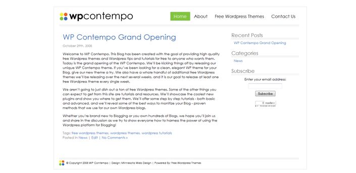
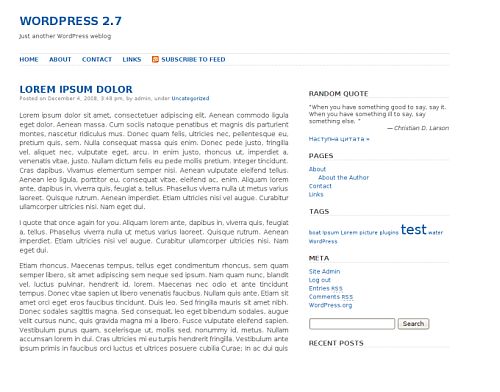
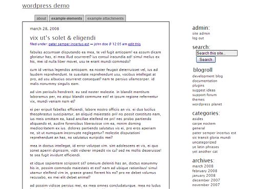
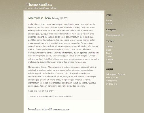
Now that the chaos of the holidays is starting to wind down I thought it would be good to return to simplicity with 5 Simple WordPress themes.
If you like your site to look clean with a lot of white space; to be simple, then these are the themes for you.
As per my usual disclaimer I have not tested any of these themes. My opinion is based solely on appearance and aesthetics.
photo credit: Manuela Hoffman


The minimalistic themes do indeed bring a breath of fresh air compared to the shiny ‘normal’ ones!!
Btw your PR seems to be back…so rejoice :D
Donace´s last blog post – Joint Ventures – A look at partnership law
welcome back Kim! These look too simplistic for me ;)
stratosg´s last blog post – Christmas giveaway winner
Very spartan.
Btw, welcome back, and yes, I too noticed that your PR has returned. Congrats! What a nice way for Google to send us into 2009. :-)
Shirley´s last blog post – What’s Up With The Wikipedia Plea for Donations?
Great ,the themes look awesome.Simplicity is the beauty of life.
Wow.
I’m kinda into minimalist themes, and these are the most minimal minimalist themes I’ve ever seen!
George
Tumblemoose´s last blog post – Ten health hazards for writers
I love minimalist themes. One of my treats for myself this year is to put aside the money to get some design work done on my blogs and board so I’m always looking for examples.
Tracy´s last blog post – Bringing Your Best
Except for Treba, everything else look way too simple for me ;)
btw, Have I told you that I love your theme? :D
I love simple white! I wonder if something like that would be good for my blog. Before my current theme, my blog was pretty white and I got bored with it quickly. Ill revisit that option sometime next year.
Carla´s last blog post – Homemade Reusable Grocery Store Bags
Welcome back, Kim! I hope you had a restful time in Vermont!
I must have looked at hundreds of themes before settling on the one I started out with. I was drawn particularly to the simplest of them, similar to the ones you have mentioned. But I wanted something more than the plain text blog title (among other things), so I chose one that allowed an image in the header, which was Wucoco.
Of course, you know that I now use Thesis. Once again, I was drawn by its simplicity and its beautiful typography. Thesis allows a lot of customization, but I have stuck with the basics because I don’t like too many bells and whistles.
Mike Nichols´s last blog post – Shameless Self-Promotion
I like these a lot better than the Citrusy themes. :-)
jim´s last blog post – Dollar Store Products Hall of Fame – December Edition
The Contempo Theme looks neat
Madhur Kapoor´s last blog post – Avoid Fake Torrents with Vertor
@Donace – Ajith noticed my PR too. I guess it was a New Years gift from Google :-)
@Stratos – I got back last night. I had this draft ready so I published it while I was traveling.
@Shirley – It’s funny … I was traveling and everyone noticed my PR before I did. And I never did write a follow-up article about it. Now if google really loved me they would have bumped it up to a 4 ;-)
@Abishek – I think they are a little too simple for me but what I like about them is they are great to build off of. Hopefully these themes will help us bring in a simpler new year.
@George – LOL They are very spartan, as Shirley noted.
@Tracy – I know a great person to hire ;-)
@Raju – Thanks! I like it too. I can’t imagine ever changing it but I suppose someday I will.
@Carla – I think the white would go well with the “green” idea but maybe not the “chic” – I think you need some color for that.
@Mike – Hi! Thanks – my trip wasn’t quite what I expected. Thesis is actually a simple theme full of features.
@Jim – Me too :-)
@Madhur – I think that one is my favorite too.
WOW!!! I’ll email you. What a great way for me to start the new year. I’m doing a happy dance right now.
@Rebecca – Congratulations!
Kim, you wouldn’t happen to also know how to do forum skins would you? If so we need to talk!
Tracy´s last blog post – Bringing Your Best
@Tracy – I haven’t done that before. What forum software do you use?
I use IPB. They are coming out with version 3.0 very soon and I think that any skin I have for the version I have now will not transfer over, so I am waiting (plus I need to gather up the money!)
I *think* that if I got a blog design that I liked and had logos made, etc that it wouldn’t be very expensive to just hire somebody to make a skin with the same color scheme and logos and maybe make some very minor customizations. My forums are fairly bare bones and that’s how we like them.
Tracy´s last blog post – Bringing Your Best
Hi Kim
I’m all about the simplicity & white space; there’s nothing that upsets me more (um, apart from war, famine…) than trying to find something to read on a cluttered, messy page. I’d already tried a couple of these, but settled on Cutline in the end. It’s a simple theme with loads of white space, but has just a wee bit more to it. I was also looking for something that had a lovely large image header and this does. It also shows any of a number of random images on reload with a few minor tweeks. I’ve not been blogging long but have found this theme fun and simple to use. Hopefully my readers get along with it to..!
The Cutline home page is here: http://cutline.tubetorial.com.
I think I’ll be coming back to your blog regularly now I’ve found it, thanks for all these great articles.
Cheers, Justine
Justine Kilkerr´s last blog post – Novel editing: the number 1 cause of procrastination. Fact.
@Justine – Thank you for visiting and commenting. And thanks for the compliments.
Cutline is a good theme. I also like Neoclassical by the same author. They provide a good framework for easy customization.