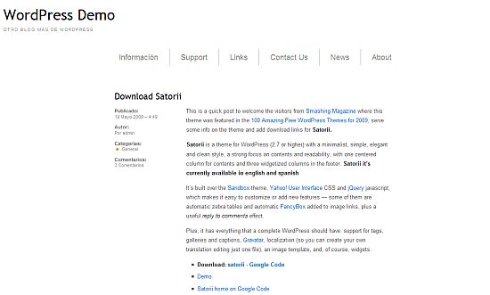
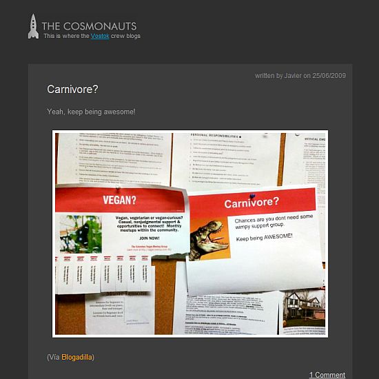
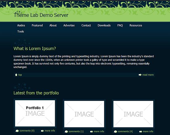
In my current batch of WordPress themes, I have 10 single column themes.
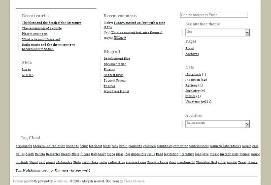
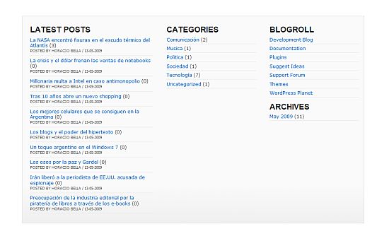
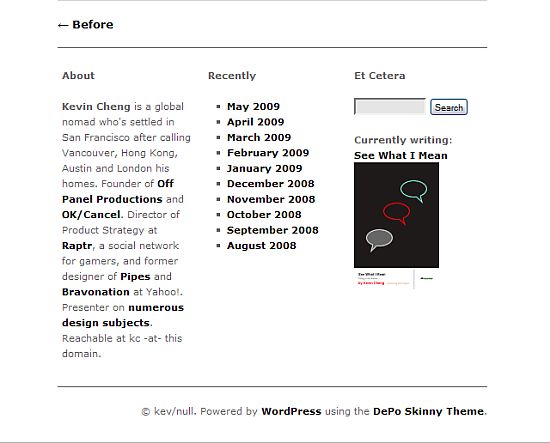
Many one column themes have elaborate footers that contain the information that is often found in the sidebar.
One column themes are ideal for photographs, short stories and essays, and any site where you really want to focus on the content.
Can you think of any other uses of a single column theme?
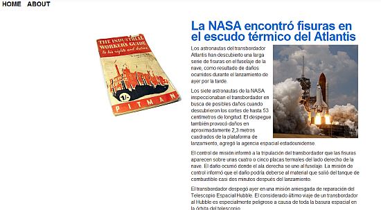
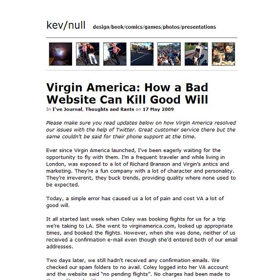
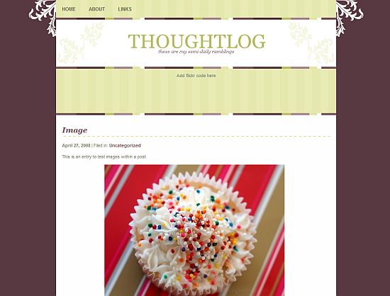
photo credit: kimberlyfaye

![National Capitol Columns [Explored] (by kimberlyfaye (busy)) National Capitol Columns [Explored] (by kimberlyfaye (busy))](http://farm4.static.flickr.com/3506/3457185100_b7be1a5d55_m.jpg)

I guess it’s what fits your needs for each project you are on. Nice list Kim!
.-= stratosg´s last blog ..The acrobatic balance of price and quality on freelancers =-.
Hi Stratos – Thanks! I like the clean look of one column but don’t think
I would want all my sidebar content in the footer.
Depends if you even need sidebar stuff. For mine or yours it’s probably not as good, but for something more simplistic and minimal one column is fine. As always the requirements define the tools ;)
.-= stratosg´s last blog ..Search feature on static HTML sites – The smart way =-.
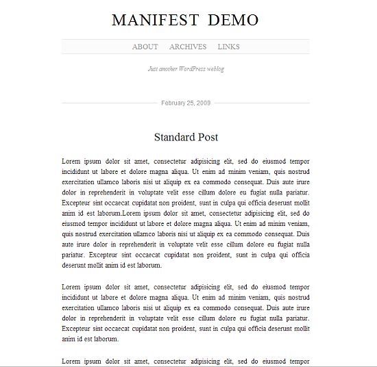
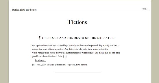
I really like Manifest. Though I love color, I love the clean look of blogs that has a white background and no other colors (besides the black font).
.-= carla | green and chic´s last blog ..Link Love: Bottled water, organic produce and more… =-.
Hi Carla – I like the way they look too. I don’t if I could practically use on
but for some sites they would be ideal.
I like the minimalist themes. I think the yummy cupcake is making me think higher of the last one though than I should be. :-)
.-= Jim´s last blog ..Poor Sammy Davis Jr. =-.
Hi Jim – CAKE!!!!!!!!!!!!
Hey, it’s amazing just how many great options there are for WordPress blogs, for sure a lay-out for every taste or need. My gut feeling too is much info will never be seen if it’s in the footer instead of a sidebar.
Not sure of another use for a single column.
And I LOVE how you used the columns photo to illustrate this. Very creative! Very Stonehenge. :)
.-= Jannie Funster´s last blog ..Why we usually eat at home =-.
Hi Jannie – I agree – I’m under the assumption that no one uses the info in my footer except for me ;-)
I try to be clever with the photos for the articles – I prefer funny but often settle for relevant. ;-)
Hi Kim,
Found your blog through Ajith’s blog. One column themes are great for adsense blogs and most of them are very good when it comes to SEO because all the content appears before the sidebar this helps SE crawlers to find the content first and then the links. Which gives a good boost in rankings. Themes like these usually have a nice adsense CTR since they are harder to navigate. People would look ten times at your in content adsense block before finding the navigation in the footer. And they are usually slim, a plus when it comes to adsense CTR.
PS: Got your email. This was the comment that I posted :-)
-Archie (Luis)
.-= Archie´s last blog ..How To Make Money Online Blogging =-.
Hi Archie – Thank you so much for coming back :-) It was such a great comment and I couldn’t believe that I accidentally deleted it.
I hadn’t thought about how a one column theme would be good for SEO – that is really interesting and useful.
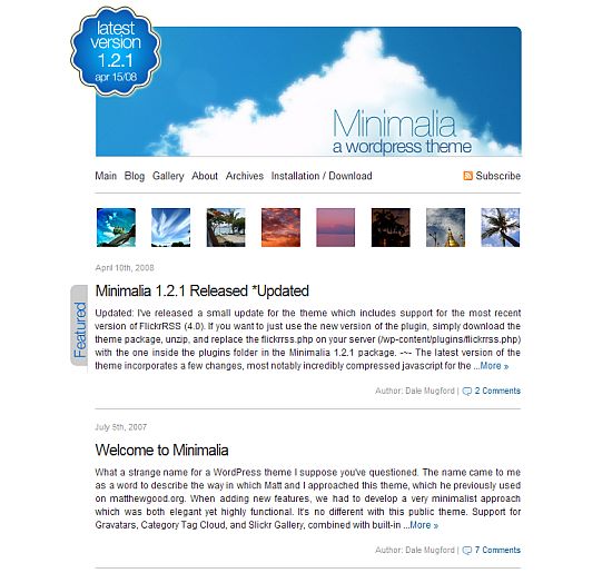
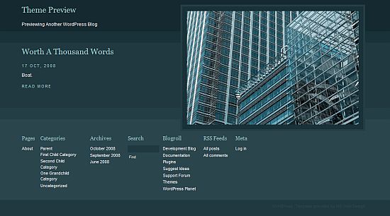
Nice selections… I think Minimalia is my favorite. :)
~ Kristi
.-= Kikolani´s last blog ..Benefits of Blogging – Becoming an Authority =-.
Hi Kristi – That would one would like great with a different header. And I like the way the flickr photos are integrated.
I find single column themes good for sales pages. Remove menus and all detractions. In fact, the only way to get off it is to either click the header or the back button.
Sounds sneaking, but in sales, it converts much better.
.-= John Hoff – WpBlogHost´s last blog ..Landing Page Optimization: Lesson Learned by Watching Jesse James is a Dead Man =-.
Hi John – Ahh … that is a good use :-) Thanks!
Nice set of themes and my favorite is the minimalia just because of the clouds and blue sky, although I wonder if the image might be a little too large for when people land on the site looking for info … not much room left to write first impressions eyecatching content
.-= Scorpi´s last blog ..Going on a camping holiday… choose your camping accessories wisely =-.
Hi Scorpi – I’m sure the header image can be removed. I would like it better with a simple title, the little thumbnail photos and then the content.
Manifest is a great theme! Best single column theme I’ve seen. Unfortunately it seems to have serious bug. This bug manifests itself when your not logged in (as a user or admin), and messes up the individual posts, cutting away the text in the article, leaving only the headline intact. Does anyone else get this when using Manifest?
Hi – I have not used it but maybe someone else has and will offer some advice.
Very handy list, thanks